The Basket Page Checklist
We have covered a lot about the product page but what if your basket to order rate is too low?
I.e. what if it’s below 30%? If you have 4,000 people add something to the basket and less than 1,200 proceed to checkout, then that’s bad.
Let’s look at the things that many people get wrong.
1. Proceed to checkout below the fold. Even if people have a lot in their basket, don’t let the proceed to checkout button get pushed down below the fold. Ideally, have it both at the top and the bottom.
2. Payment icons such as Visa, Mastercard etc. These companies spend millions if not billions a year associating these logos with trust in the minds of the consumer. So, make sure you leverage this by showing them above the fold.
3. Payment icons on every line item in the basket. I have seen split tests convert higher when payment icons are shown next to each item in the basket rather than just at the bottom.
4. Use wording like continue securely rather than proceed to checkout. This split tested higher for us as people are worried about security online.
“Perceived Ease Of Use Is Pretty Much Equal To Actual Ease Of Use”
5. Make sure that the basket is nicely laid out and does not look complicated. Remember perceived ease of use is pretty much equal to actual ease of use. Don’t over complicate and get a usability designer to design your basket.
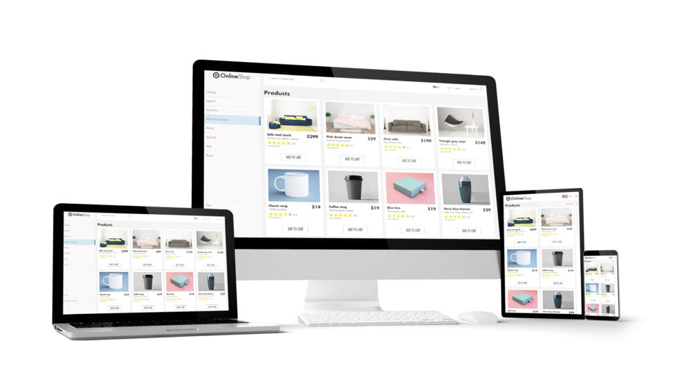
6. Don’t make your product images too small. People need to maintain the desire for the product they are buying and making them too small means they might lose their interest. The desire for the product must be bigger than the pain of paying for them.
7. Have a clear colour for the proceed to checkout button. Make this a colour that is not used anywhere else in the design, so it stands out. Also, it should be the same colour as all the move forward buttons on the store. I.e. The add to basket, proceed to checkout and confirm order buttons should all be the same colour.
“Delivery Should Be Clearly Displayed”
8. Delivery should be clearly displayed. How long it will take and how much it will be. Preferably delivery will be free or free over a certain amount. If they have qualified for free delivery, shout about it and make it dynamic when the threshold is reached.
9. If you have a free delivery threshold and the person has not hit that level yet. Then tell them exactly how much more they need to spend to hit free delivery. I.e. spend £5.50 more to qualify for free delivery.
10. Make your returns policy clear. People will be asking, what if I don’t like it. Don’t hide your returns policy in the footer of the site. The returns policy should be a good policy and it should be a selling point.
“Monitor Coupons That Fail To Trigger A Discount”
11. If people use a lot of coupons on your store, make sure you monitor coupons that fail to trigger a discount. Get these to be emailed to you so you and spot common misspelling or typos of active coupons. Often you can create coupons of these typos so that you get the orders.
12. Make live chat prominent on the basket page so that buyer questions can be answered quickly.
13. Use countdown timers to show how long it is till they qualify for next day delivery.
14. Use countdown timers to show how long it is till the coupon they have used expires.
15. Use third-party review stars and reviews to give people confidence that you can deliver the product on time.
There’s no point spending a huge amount on Google Shopping until you know that your sales can scale with ad spend. If you are struggling to make Google Adwords work have a look at our Google Shopping Case study here http://go.markhammersley.co/get-started
Thanks
Mark (Basket Case) Hammersley


As a Manchester Magento development agency we are happy to invite you to the Manchester Magento meetup which we host found here >.

Great that all the main developers are now fully Magento Certified. Well done everyone https://www.linkedin.com/pulse/now-100-magento-certified-all-smartebusiness-ian-hammersley

Happy to announce that we are fully up to speed with  Magento 2!