10 Product Page Checklist For Conversion Rate Optimisation
I’m at Auckland airport now and it’s loud as there is a lot of construction going on. Ian and I are meeting in Phuket soon (have you been there any tips?).
Like the Airport there is so much noise going on in our businesses that we sometimes forget the basics.
Therefore, today I am going to give you a product page checklist so that you can increase the efficiency of this important page.
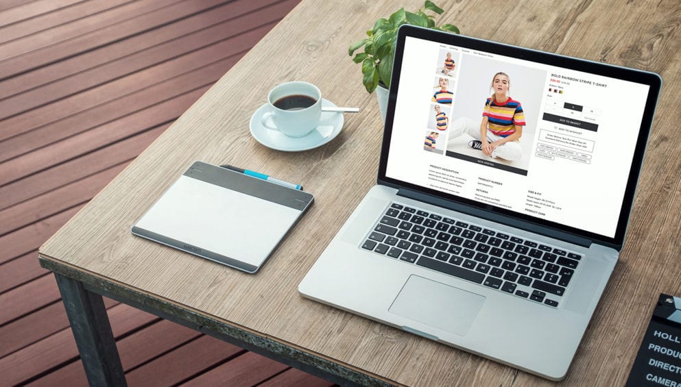
1) A common mistake is not putting the add to the basket button above the fold. I.e. making a user scroll to see the add to basket button on some of the most used screen dimensions. Make sure the product options and add to basket button is shown first then the description.
2) Delivery information should be clearly displayed near the add to basket button. It’s no good having it in the header or footer. It needs to be where the person is looking. Delivery should mention that it’s free (if it is) and how fast it is.
“Show The Number Of Reviews And Invite People To Read Them”
3) Reviews should be prominently displayed underneath the product title or near the title. Again, where people are looking. Reviews should be done via a reputable third-party review system e.g. feefo, Trustpilot etc. Show the number of reviews and invite people to read them.
4) Images should be large and be done well.
5) If the item is jewellery or something that is hard to work out the scale of. Have one photo that has the item next to a hand or something people know the size of. This way people can understand how big it is.
6) Make sure there is more than one image, a lifestyle shot, close up shots etc
7) In stock declaration. This should be bold and noticeable in the key eye focus area. If stock is particularly important to a person i.e. when they need it now make the stock icon dynamic so it looks like its looking up the item in the warehouse and then showing it in stock.
“We Tend To Lose People Who The Product Is Not Quite Right For”
8) On the product page underneath the buying information or description we tend to lose people who the product is not quite right for. So, show see other products in this category. E.g. if you are selling Gore Tex hiking boots and the person is on an Adidas Gore-Tex Hiking Boot product page then show links for ‘see other Gore-Tex Boots’ and ‘See other Adidas Boots’ etc. This will keep them on the site rather than hitting the back button back to Google.
9) The description should not include any words that people might not have in their vocab. Anything hard will shift their thinking to system 2 thinking and we don’t want people to think yet.
10) Make the Add to Basket button clickable even if people have not selected the quantity yet. Don’t grey it out until they have selected quantity. If they click it too early, then show them a message telling them they must add quantity. If you grey it out people won’t see it and they might think it’s out of stock.
Have a look at our Magento Split Test Case Study here http://go.smartebusiness.co.uk/get-started-magento
Thanks
Mark (Checklist) Hammersley


As a Manchester Magento development agency we are happy to invite you to the Manchester Magento meetup which we host found here >.

Great that all the main developers are now fully Magento Certified. Well done everyone https://www.linkedin.com/pulse/now-100-magento-certified-all-smartebusiness-ian-hammersley

Happy to announce that we are fully up to speed with  Magento 2!